#  layoutz
**Simple, beautiful CLI output for Haskell 🪶**
Build declarative and composable sections, trees, tables, dashboards, and interactive Elm-style TUI's.
Part of [d4](https://github.com/mattlianje/d4) • Also in: [JavaScript](https://github.com/mattlianje/layoutz/tree/master/layoutz-ts), [Scala](https://github.com/mattlianje/layoutz)
## Features
- Zero dependencies, use `Layoutz.hs` like a header file
- Rich text formatting: alignment, underlines, padding, margins
- Lists, trees, tables, charts, spinners...
- ANSI colors and wide character support
- Easily create new primitives (no component-library limitations)
- [`LayoutzApp`](#interactive-apps) for Elm-style TUI's
layoutz
**Simple, beautiful CLI output for Haskell 🪶**
Build declarative and composable sections, trees, tables, dashboards, and interactive Elm-style TUI's.
Part of [d4](https://github.com/mattlianje/d4) • Also in: [JavaScript](https://github.com/mattlianje/layoutz/tree/master/layoutz-ts), [Scala](https://github.com/mattlianje/layoutz)
## Features
- Zero dependencies, use `Layoutz.hs` like a header file
- Rich text formatting: alignment, underlines, padding, margins
- Lists, trees, tables, charts, spinners...
- ANSI colors and wide character support
- Easily create new primitives (no component-library limitations)
- [`LayoutzApp`](#interactive-apps) for Elm-style TUI's

TaskListDemo.hs • SimpleGame.hs
## Table of Contents
- [Installation](#installation)
- [Quickstart](#quickstart)
- [Why layoutz?](#why-layoutz)
- [Core Concepts](#core-concepts)
- [Elements](#elements)
- [Border Styles](#border-styles)
- [Colors](#colors-ansi-support)
- [Styles](#styles-ansi-support)
- [Custom Components](#custom-components)
- [Interactive Apps](#interactive-apps)
## Installation
**Add Layoutz on [Hackage](https://hackage.haskell.org/package/layoutz) to your project's `.cabal` file:**
```haskell
build-depends: layoutz
```
All you need:
```haskell
import Layoutz
```
## Quickstart
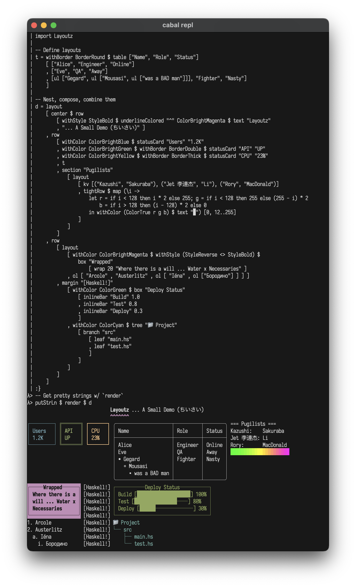
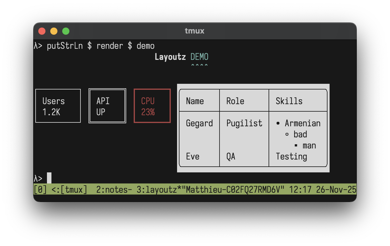
**(1/2) Static rendering** - Beautiful, compositional strings:
```haskell
import Layoutz
demo = layout
[ center $ row
[ withStyle StyleBold $ text "Layoutz"
, withColor ColorCyan $ underline' "ˆ" $ text "DEMO"
]
, br
, row
[ statusCard "Users" "1.2K"
, withBorder BorderDouble $ statusCard "API" "UP"
, withColor ColorRed $ withBorder BorderThick $ statusCard "CPU" "23%"
, withStyle StyleReverse $ withBorder BorderRound $ table ["Name", "Role", "Skills"]
[ ["Gegard", "Pugilist", ul ["Armenian", ul ["bad", ul["man"]]]]
, ["Eve", "QA", "Testing"]
]
]
]
putStrLn $ render demo
```
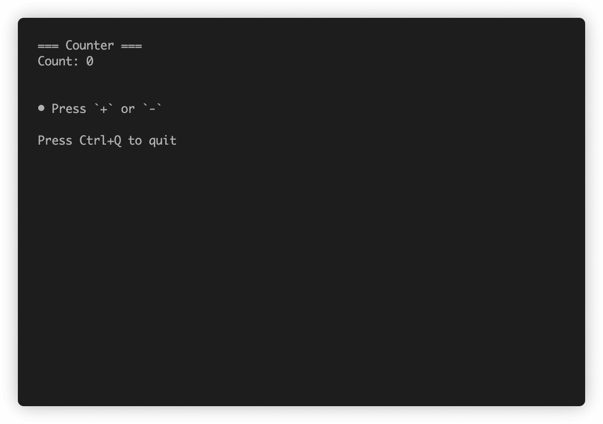
**(2/2) Interactive apps** - Build Elm-style TUI's:
```haskell
import Layoutz
data Msg = Inc | Dec
counterApp :: LayoutzApp Int Msg
counterApp = LayoutzApp
{ appInit = (0, None)
, appUpdate = \msg count -> case msg of
Inc -> (count + 1, None)
Dec -> (count - 1, None)
, appSubscriptions = \_ -> onKeyPress $ \key -> case key of
CharKey '+' -> Just Inc
CharKey '-' -> Just Dec
_ -> Nothing
, appView = \count -> layout
[ section "Counter" [text $ "Count: " <> show count]
, ul ["Press '+' or '-'", "ESC to quit"]
]
}
main = runApp counterApp
```
## Why layoutz?
- We have `printf` and [full-blown](https://hackage.haskell.org/package/brick) TUI libraries - but there's a gap in-between
- **layoutz** is a tiny, declarative DSL for structured CLI output
- On the side, it has a little Elm-style runtime + keyhandling DSL to animate your elements, much like a flipbook...
- But you can just use **Layoutz** without any of the TUI stuff
## Core concepts
- Every piece of content is an `Element`
- Elements are **immutable** and **composable** - build complex layouts by combining simple elements
- A `layout` arranges elements **vertically**:
```haskell
layout [elem1, elem2, elem3] -- Joins with "\n"
```
Call `render` on any element to get a string
The power comes from **uniform composition** - since everything has the `Element` typeclass, everything can be combined.
### String Literals
With `OverloadedStrings` enabled, you can use string literals directly:
```haskell
layout ["Hello", "World"] -- Instead of layout [text "Hello", text "World"]
```
**Note:** When passing to functions that take polymorphic `Element a` parameters (like `underline'`, `center'`, `pad`), use `text` explicitly:
```haskell
underline' "=" $ text "Title" -- Correct
underline' "=" "Title" -- Ambiguous type error
```
## Elements
### Text
```haskell
text "Simple text"
-- Or with OverloadedStrings:
"Simple text"
```
```
Simple text
```
### Line Break
Add line breaks with `br`:
```haskell
layout ["Line 1", br, "Line 2"]
```
```
Line 1
Line 2
```
### Section: `section`
```haskell
section "Config" [kv [("env", "prod")]]
section' "-" "Status" [kv [("health", "ok")]]
section'' "#" "Report" 5 [kv [("items", "42")]]
```
```
=== Config ===
env: prod
--- Status ---
health: ok
##### Report #####
items: 42
```
### Layout (vertical): `layout`
```haskell
layout ["First", "Second", "Third"]
```
```
First
Second
Third
```
### Row (horizontal): `row`
Arrange elements side-by-side horizontally:
```haskell
row ["Left", "Middle", "Right"]
```
```
Left Middle Right
```
Multi-line elements are aligned at the top:
```haskell
row
[ layout ["Left", "Column"]
, layout ["Middle", "Column"]
, layout ["Right", "Column"]
]
```
### Tight Row: `tightRow`
Like `row`, but with no spacing between elements (useful for gradients and progress bars):
```haskell
tightRow [withColor ColorRed $ text "█", withColor ColorGreen $ text "█", withColor ColorBlue $ text "█"]
```
```
███
```
### Text alignment: `alignLeft`, `alignRight`, `alignCenter`, `justify`
Align text within a specified width:
```haskell
layout
[ alignLeft 40 "Left aligned"
, alignCenter 40 "Centered"
, alignRight 40 "Right aligned"
, justify 40 "This text is justified evenly"
]
```
```
Left aligned
Centered
Right aligned
This text is justified evenly
```
### Horizontal rule: `hr`
```haskell
hr
hr' "~"
hr'' "-" 10
```
```
──────────────────────────────────────────────────
~~~~~~~~~~~~~~~~~~~~~~~~~~~~~~~~~~~~~~~~~~~~~~~~~~
----------
```
### Vertical rule: `vr`
```haskell
row [vr, vr' "║", vr'' "x" 5]
```
```
│ ║ x
│ ║ x
│ ║ x
│ ║ x
│ ║ x
│ ║
│ ║
│ ║
│ ║
│ ║
```
### Key-value pairs: `kv`
```haskell
kv [("name", "Alice"), ("role", "admin")]
```
```
name: Alice
role: admin
```
### Table: `table`
Tables automatically handle alignment and borders:
```haskell
table ["Name", "Age", "City"]
[ ["Alice", "30", "New York"]
, ["Bob", "25", ""]
, ["Charlie", "35", "London"]
]
```
```
┌─────────┬─────┬─────────┐
│ Name │ Age │ City │
├─────────┼─────┼─────────┤
│ Alice │ 30 │ New York│
│ Bob │ 25 │ │
│ Charlie │ 35 │ London │
└─────────┴─────┴─────────┘
```
### Unordered Lists: `ul`
Clean unordered lists with automatic nesting:
```haskell
ul ["Feature A", "Feature B", "Feature C"]
```
```
• Feature A
• Feature B
• Feature C
```
Nested lists with auto-styling:
```haskell
ul [ "Backend"
, ul ["API", "Database"]
, "Frontend"
, ul ["Components", ul ["Header", ul ["Footer"]]]
]
```
```
• Backend
◦ API
◦ Database
• Frontend
◦ Components
▪ Header
• Footer
```
### Ordered Lists: `ol`
Numbered lists with automatic nesting:
```haskell
ol ["First step", "Second step", "Third step"]
```
```
1. First step
2. Second step
3. Third step
```
Nested ordered lists with automatic style cycling (numbers → letters → roman numerals):
```haskell
ol [ "Setup"
, ol ["Install dependencies", "Configure", ol ["Check version"]]
, "Build"
, "Deploy"
]
```
```
1. Setup
a. Install dependencies
b. Configure
i. Check version
2. Build
3. Deploy
```
### Underline: `underline`
Add underlines to any element:
```haskell
underline "Important Title"
underline' "=" $ text "Custom" -- Use text for custom underline char
```
```
Important Title
───────────────
Custom
══════
```
### Box: `box`
With title:
```haskell
box "Summary" [kv [("total", "42")]]
```
```
┌──Summary───┐
│ total: 42 │
└────────────┘
```
Without title:
```haskell
box "" [kv [("total", "42")]]
```
```
┌────────────┐
│ total: 42 │
└────────────┘
```
### Status card: `statusCard`
```haskell
statusCard "CPU" "45%"
```
```
┌───────┐
│ CPU │
│ 45% │
└───────┘
```
### Progress bar: `inlineBar`
```haskell
inlineBar "Download" 0.75
```
```
Download [███████████████─────] 75%
```
### Tree: `tree`
```haskell
tree "Project"
[ branch "src"
[ leaf "main.hs"
, leaf "test.hs"
]
, branch "docs"
[ leaf "README.md"
]
]
```
```
Project
├── src
│ ├── main.hs
│ └── test.hs
└── docs
└── README.md
```
### Chart: `chart`
```haskell
chart [("Web", 10), ("Mobile", 20), ("API", 15)]
```
```
Web │████████████████████ 10
Mobile │████████████████████████████████████████ 20
API │██████████████████████████████ 15
```
### Padding: `pad`
Add uniform padding around any element:
```haskell
pad 2 $ text "content"
```
```
content
```
### Spinners: `spinner`
Animated loading spinners for TUI apps:
```haskell
spinner "Loading..." frameNum SpinnerDots
spinner "Processing" frameNum SpinnerLine
spinner "Working" frameNum SpinnerClock
spinner "Thinking" frameNum SpinnerBounce
```
Styles:
- **`SpinnerDots`** - Braille dot spinner: ⠋ ⠙ ⠹ ⠸ ⠼ ⠴ ⠦ ⠧ ⠇ ⠏
- **`SpinnerLine`** - Classic line spinner: | / - \
- **`SpinnerClock`** - Clock face spinner: 🕐 🕑 🕒 ...
- **`SpinnerBounce`** - Bouncing dots: ⠁ ⠂ ⠄ ⠂
Increment the frame number on each render to animate:
```haskell
-- In your app state, track a frame counter
data AppState = AppState { spinnerFrame :: Int, ... }
-- In your view function
spinner "Loading" (spinnerFrame state) SpinnerDots
-- In your update function (triggered by a tick or key press)
state { spinnerFrame = spinnerFrame state + 1 }
```
With colors:
```haskell
withColor ColorGreen $ spinner "Success!" frame SpinnerDots
withColor ColorYellow $ spinner "Warning" frame SpinnerLine
```
### Centering: `center`
Smart auto-centering and manual width:
```haskell
center "Auto-centered" -- Uses layout context
center' 20 "Manual width" -- Fixed width
```
```
Auto-centered
Manual width
```
### Margin: `margin`
Add prefix margins to elements for compiler-style error messages:
```haskell
margin "[error]"
[ text "Ooops"
, text ""
, row [ text "result :: Int = "
, underline' "^" $ text "getString"
]
, text "Expected Int, found String"
]
```
```
[error] Ooops
[error]
[error] result :: Int = getString
[error] ^^^^^^^^^
[error] Expected Int, found String
```
## Border Styles
Elements like `box`, `table`, and `statusCard` support different border styles:
**BorderNormal** (default):
```haskell
box "Title" ["content"]
```
```
┌──Title──┐
│ content │
└─────────┘
```
**BorderDouble**:
```haskell
withBorder BorderDouble $ statusCard "API" "UP"
```
```
╔═══════╗
║ API ║
║ UP ║
╚═══════╝
```
**BorderThick**:
```haskell
withBorder BorderThick $ table ["Name"] [["Alice"]]
```
```
┏━━━━━━━┓
┃ Name ┃
┣━━━━━━━┫
┃ Alice ┃
┗━━━━━━━┛
```
**BorderRound**:
```haskell
withBorder BorderRound $ box "Info" ["content"]
```
```
╭──Info───╮
│ content │
╰─────────╯
```
**BorderNone** (invisible borders):
```haskell
withBorder BorderNone $ box "Info" ["content"]
```
```
Info
content
```
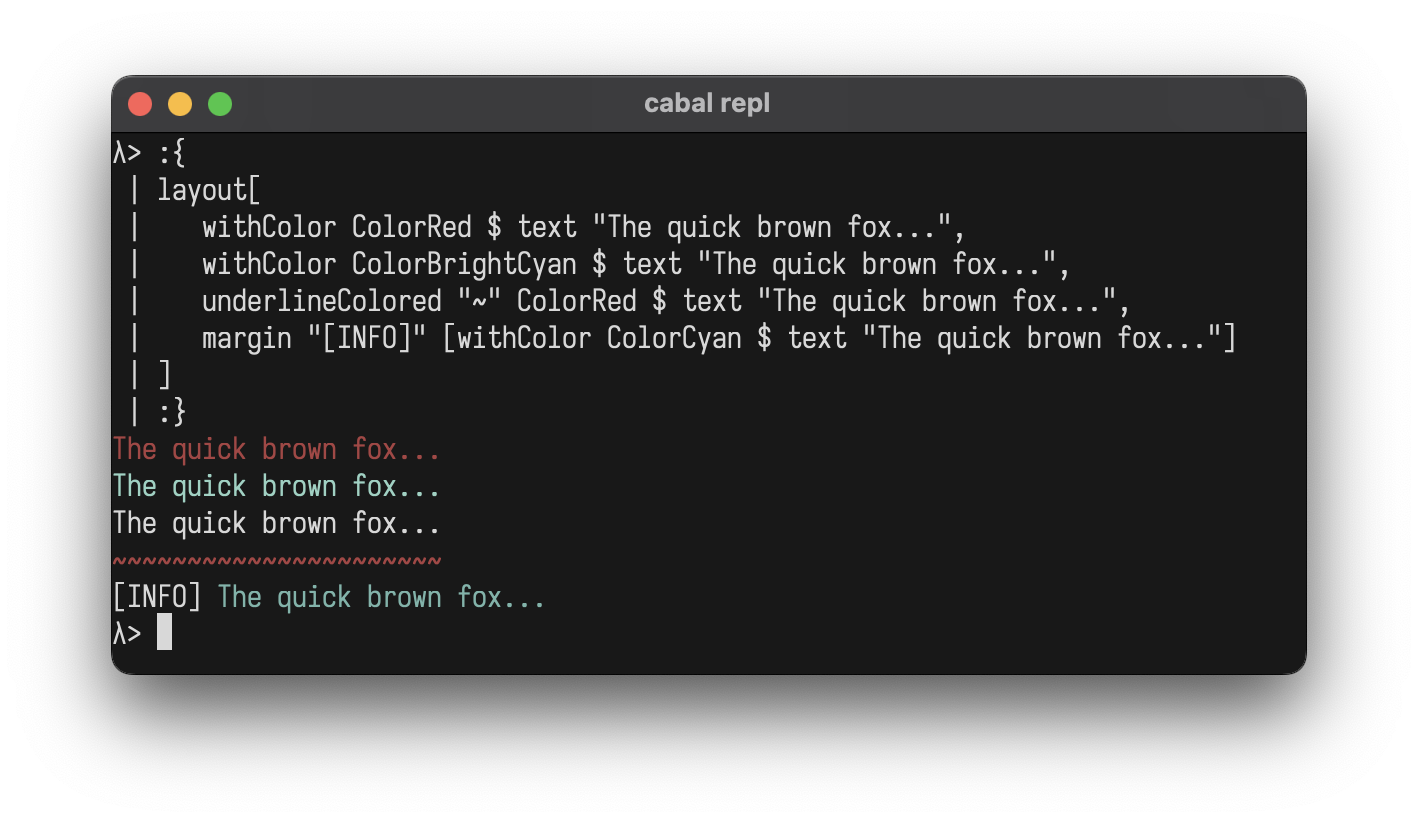
## Colors (ANSI Support)
Add ANSI colors to any element:
```haskell
layout[
withColor ColorRed $ text "The quick brown fox...",
withColor ColorBrightCyan $ text "The quick brown fox...",
underlineColored "~" ColorRed $ text "The quick brown fox...",
margin "[INFO]" [withColor ColorCyan $ text "The quick brown fox..."]
]
```
**Standard Colors:**
- `ColorBlack` `ColorRed` `ColorGreen` `ColorYellow` `ColorBlue` `ColorMagenta` `ColorCyan` `ColorWhite`
- `ColorBrightBlack` `ColorBrightRed` `ColorBrightGreen` `ColorBrightYellow` `ColorBrightBlue` `ColorBrightMagenta` `ColorBrightCyan` `ColorBrightWhite`
- `ColorNoColor` *(for conditional formatting)*
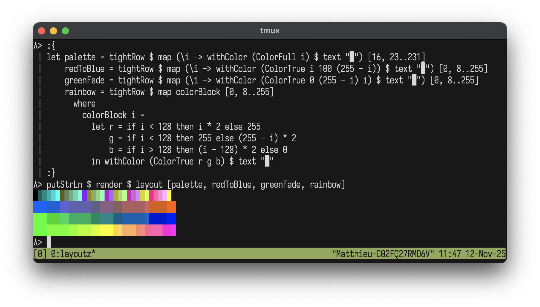
**Extended Colors:**
- `ColorFull n` - 256-color palette (0-255)
- `ColorTrue r g b` - 24-bit RGB true color
### Color Gradients
Create beautiful gradients with extended colors:
```haskell
let palette = tightRow $ map (\i -> withColor (ColorFull i) $ text "█") [16, 19..205]
redToBlue = tightRow $ map (\i -> withColor (ColorTrue i 100 (255 - i)) $ text "█") [0, 4..255]
greenFade = tightRow $ map (\i -> withColor (ColorTrue 0 (255 - i) i) $ text "█") [0, 4..255]
rainbow = tightRow $ map colorBlock [0, 4..255]
where
colorBlock i =
let r = if i < 128 then i * 2 else 255
g = if i < 128 then 255 else (255 - i) * 2
b = if i > 128 then (i - 128) * 2 else 0
in withColor (ColorTrue r g b) $ text "█"
putStrLn $ render $ layout [palette, redToBlue, greenFade, rainbow]
```
## Styles (ANSI Support)
Add ANSI styles to any element:
```haskell
layout[
withStyle StyleBold $ text "The quick brown fox...",
withColor ColorRed $ withStyle StyleBold $ text "The quick brown fox...",
withStyle StyleReverse $ withStyle StyleItalic $ text "The quick brown fox..."
]
```
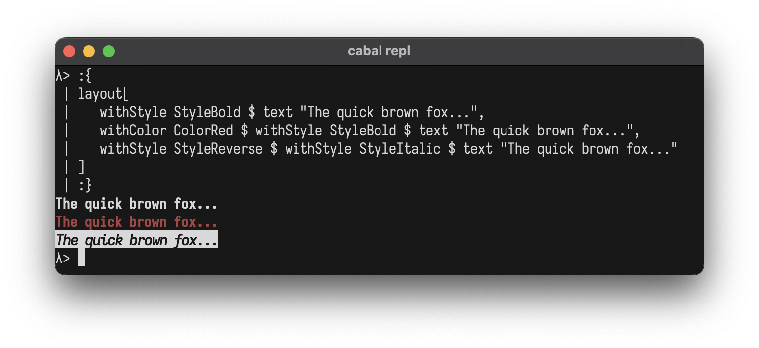
**Styles:**
- `StyleBold` `StyleDim` `StyleItalic` `StyleUnderline`
- `StyleBlink` `StyleReverse` `StyleHidden` `StyleStrikethrough`
- `StyleNoStyle` *(for conditional formatting)*
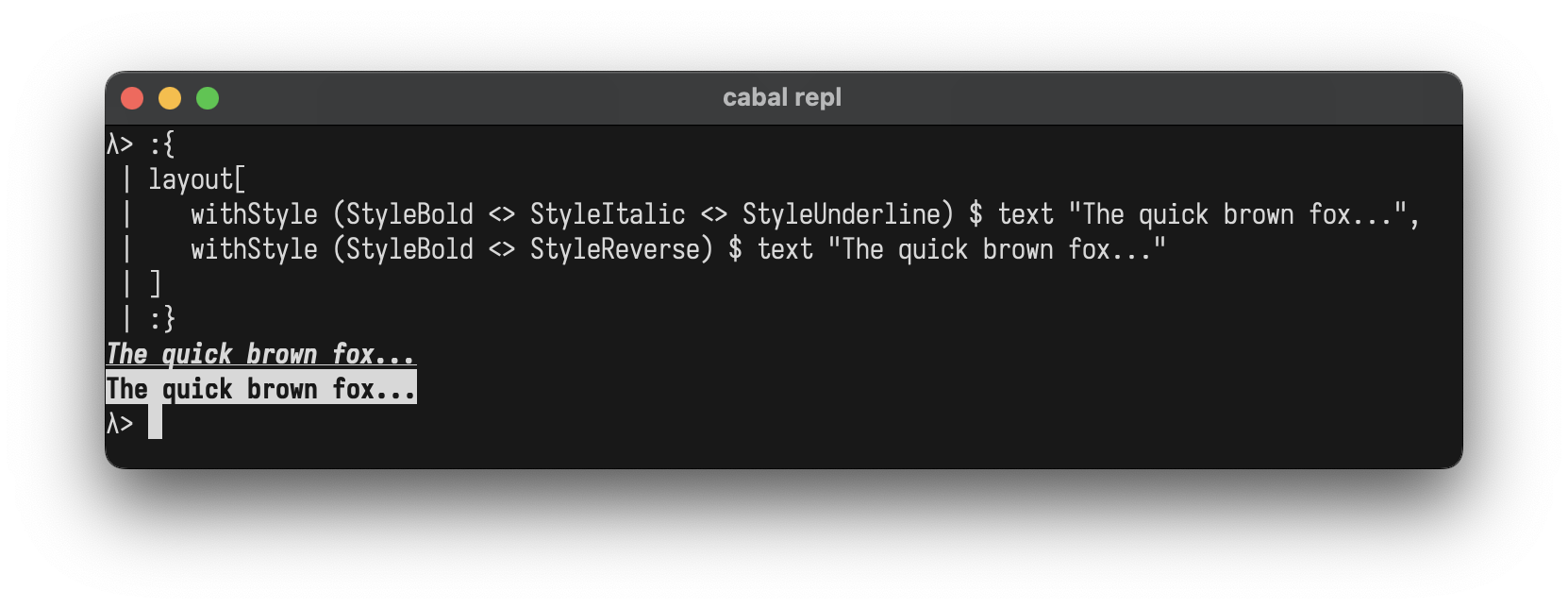
**Combining Styles:**
Use `<>` to combine multiple styles at once:
```haskell
layout[
withStyle (StyleBold <> StyleItalic <> StyleUnderline) $ text "The quick brown fox...",
withStyle (StyleBold <> StyleReverse) $ text "The quick brown fox..."
]
```
You can also combine colors and styles:
```haskell
withColor ColorBrightYellow $ withStyle (StyleBold <> StyleItalic) $ text "The quick brown fox..."
```
## Custom Components
Create your own components by implementing the `Element` typeclass
```haskell
data Square = Square Int
instance Element Square where
renderElement (Square size)
| size < 2 = ""
| otherwise = intercalate "\n" (top : middle ++ [bottom])
where
w = size * 2 - 2
top = "┌" ++ replicate w '─' ++ "┐"
middle = replicate (size - 2) ("│" ++ replicate w ' ' ++ "│")
bottom = "└" ++ replicate w '─' ++ "┘"
-- Helper to avoid wrapping with L
square :: Int -> L
square n = L (Square n)
-- Use it like any other element
putStrLn $ render $ row
[ square 3
, square 5
, square 7
]
```
```
┌────┐ ┌────────┐ ┌────────────┐
│ │ │ │ │ │
└────┘ │ │ │ │
│ │ │ │
└────────┘ │ │
│ │
└────────────┘
```
## REPL
Drop into GHCi to experiment:
```bash
cabal repl
```
```haskell
λ> :set -XOverloadedStrings
λ> import Layoutz
λ> putStrLn $ render $ center $ box "Hello" ["World!"]
┌──Hello──┐
│ World! │
└─────────┘
λ> putStrLn $ render $ table ["A", "B"] [["1", "2"]]
┌───┬───┐
│ A │ B │
├───┼───┤
│ 1 │ 2 │
└───┴───┘
```
## Interactive Apps
Build **Elm-style terminal applications** with the built-in TUI runtime.
```haskell
import Layoutz
data Msg = Inc | Dec
counterApp :: LayoutzApp Int Msg
counterApp = LayoutzApp
{ appInit = (0, None)
, appUpdate = \msg count -> case msg of
Inc -> (count + 1, None)
Dec -> (count - 1, None)
, appSubscriptions = \_ -> onKeyPress $ \key -> case key of
CharKey '+' -> Just Inc
CharKey '-' -> Just Dec
_ -> Nothing
, appView = \count -> layout
[ section "Counter" [text $ "Count: " <> show count]
, ul ["Press '+' or '-'", "ESC to quit"]
]
}
main = runApp counterApp
```
### How the Runtime Works
The `runApp` function spawns three daemon threads:
- **Render thread** - Continuously renders `appView state` to terminal (~30fps)
- **Input thread** - Reads keys, maps via `appSubscriptions`, calls `appUpdate`
- **Command thread** - Executes `Cmd` side effects async, feeds results back
As per the above, commands run without blocking the UI.
Press **ESC** to exit.
### `LayoutzApp state msg`
```haskell
data LayoutzApp state msg = LayoutzApp
{ appInit :: (state, Cmd msg) -- Initial state + startup command
, appUpdate :: msg -> state -> (state, Cmd msg) -- Pure state transitions
, appSubscriptions :: state -> Sub msg -- Event sources
, appView :: state -> L -- Render to UI
}
```
### Subscriptions
| Subscription | Description |
|--------------|-------------|
| `onKeyPress (Key -> Maybe msg)` | Keyboard input |
| `onTick msg` | Periodic ticks (~100ms) for animations |
| `batch [sub1, sub2, ...]` | Combine subscriptions |
### Commands
| Command | Description |
|---------|-------------|
| `None` | No effect |
| `Cmd (IO (Maybe msg))` | Run IO, optionally produce message |
| `Batch [cmd1, cmd2, ...]` | Multiple commands |
| `cmd :: IO () -> Cmd msg` | Fire and forget |
| `cmdMsg :: IO msg -> Cmd msg` | IO that returns a message |
**Example: Logger with file I/O**
```haskell
import Layoutz
data Msg = Log | Saved
data State = State { count :: Int, status :: String }
loggerApp :: LayoutzApp State Msg
loggerApp = LayoutzApp
{ appInit = (State 0 "Ready", None)
, appUpdate = \msg s -> case msg of
Log -> (s { count = count s + 1 },
cmd $ appendFile "log.txt" ("Entry " <> show (count s) <> "\n"))
Saved -> (s { status = "Saved!" }, None)
, appSubscriptions = \_ -> onKeyPress $ \key -> case key of
CharKey 'l' -> Just Log
_ -> Nothing
, appView = \s -> layout
[ section "Logger" [text $ "Entries: " <> show (count s)]
, text (status s)
, ul ["'l' to log", "ESC to quit"]
]
}
main = runApp loggerApp
```
### Key Types
```haskell
CharKey Char -- 'a', '1', ' '
EnterKey, BackspaceKey, TabKey, EscapeKey, DeleteKey
ArrowUpKey, ArrowDownKey, ArrowLeftKey, ArrowRightKey
SpecialKey String -- "Ctrl+C", etc.
```
## Inspiration
- Original Scala [layoutz](https://github.com/mattlianje/layoutz)