| Copyright | Will Thompson and Iñaki García Etxebarria |
|---|---|
| License | LGPL-2.1 |
| Maintainer | Iñaki García Etxebarria |
| Safe Haskell | Safe-Inferred |
| Language | Haskell2010 |
GI.Gtk.Objects.MenuButton
Description
The GtkMenuButton widget is used to display a popup when clicked.

This popup can be provided either as a GtkPopover or as an abstract
GMenuModel.
The GtkMenuButton widget can show either an icon (set with the
MenuButton:iconName property) or a label (set with the
MenuButton:label property). If neither is explicitly set,
a Image is automatically created, using an arrow image oriented
according to MenuButton:direction or the generic
“open-menu-symbolic” icon if the direction is not set.
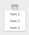
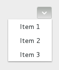
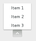
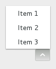
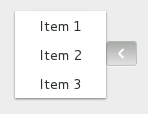
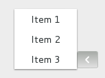
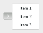
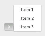
The positioning of the popup is determined by the MenuButton:direction property of the menu button.
For menus, the Widget:halign and Widget:valign
properties of the menu are also taken into account. For example, when the
direction is ArrowTypeDown and the horizontal alignment is AlignStart,
the menu will be positioned below the button, with the starting edge
(depending on the text direction) of the menu aligned with the starting
edge of the button. If there is not enough space below the button, the
menu is popped up above the button instead. If the alignment would move
part of the menu offscreen, it is “pushed in”.
| | start | center | end |
| - | --- | --- | --- |
| **down** | 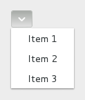 |
|  |
|  |
| **up** |
|
| **up** | 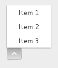 |
|  |
|  |
| **left** |
|
| **left** | 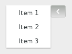 |
|  |
|  |
| **right** |
|
| **right** | 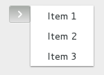 |
|  |
|  |
|
CSS nodes
menubutton
╰── button.toggle
    ╰── <content>
         ╰── [arrow]
GtkMenuButton has a single CSS node with name menubutton
which contains a button node with a .toggle style class.
If the button contains only an icon or an arrow, it will have the
.image-button style class, if it contains both, it will have the
.arrow-button style class.
Inside the toggle button content, there is an arrow node for
the indicator, which will carry one of the .none, .up, .down,
.left or .right style classes to indicate the direction that
the menu will appear in. The CSS is expected to provide a suitable
image for each of these cases using the -gtk-icon-source property.
Optionally, the menubutton node can carry the .circular style class
to request a round appearance.
Accessibility
GtkMenuButton uses the AccessibleRoleButton role.
Synopsis
- newtype MenuButton = MenuButton (ManagedPtr MenuButton)
- class (GObject o, IsDescendantOf MenuButton o) => IsMenuButton o
- toMenuButton :: (MonadIO m, IsMenuButton o) => o -> m MenuButton
- menuButtonGetAlwaysShowArrow :: (HasCallStack, MonadIO m, IsMenuButton a) => a -> m Bool
- menuButtonGetDirection :: (HasCallStack, MonadIO m, IsMenuButton a) => a -> m ArrowType
- menuButtonGetHasFrame :: (HasCallStack, MonadIO m, IsMenuButton a) => a -> m Bool
- menuButtonGetIconName :: (HasCallStack, MonadIO m, IsMenuButton a) => a -> m Text
- menuButtonGetLabel :: (HasCallStack, MonadIO m, IsMenuButton a) => a -> m Text
- menuButtonGetMenuModel :: (HasCallStack, MonadIO m, IsMenuButton a) => a -> m (Maybe MenuModel)
- menuButtonGetPopover :: (HasCallStack, MonadIO m, IsMenuButton a) => a -> m (Maybe Popover)
- menuButtonGetPrimary :: (HasCallStack, MonadIO m, IsMenuButton a) => a -> m Bool
- menuButtonGetUseUnderline :: (HasCallStack, MonadIO m, IsMenuButton a) => a -> m Bool
- menuButtonNew :: (HasCallStack, MonadIO m) => m MenuButton
- menuButtonPopdown :: (HasCallStack, MonadIO m, IsMenuButton a) => a -> m ()
- menuButtonPopup :: (HasCallStack, MonadIO m, IsMenuButton a) => a -> m ()
- menuButtonSetAlwaysShowArrow :: (HasCallStack, MonadIO m, IsMenuButton a) => a -> Bool -> m ()
- menuButtonSetCreatePopupFunc :: (HasCallStack, MonadIO m, IsMenuButton a) => a -> Maybe MenuButtonCreatePopupFunc -> m ()
- menuButtonSetDirection :: (HasCallStack, MonadIO m, IsMenuButton a) => a -> ArrowType -> m ()
- menuButtonSetHasFrame :: (HasCallStack, MonadIO m, IsMenuButton a) => a -> Bool -> m ()
- menuButtonSetIconName :: (HasCallStack, MonadIO m, IsMenuButton a) => a -> Text -> m ()
- menuButtonSetLabel :: (HasCallStack, MonadIO m, IsMenuButton a) => a -> Text -> m ()
- menuButtonSetMenuModel :: (HasCallStack, MonadIO m, IsMenuButton a, IsMenuModel b) => a -> Maybe b -> m ()
- menuButtonSetPopover :: (HasCallStack, MonadIO m, IsMenuButton a, IsWidget b) => a -> Maybe b -> m ()
- menuButtonSetPrimary :: (HasCallStack, MonadIO m, IsMenuButton a) => a -> Bool -> m ()
- menuButtonSetUseUnderline :: (HasCallStack, MonadIO m, IsMenuButton a) => a -> Bool -> m ()
- constructMenuButtonAlwaysShowArrow :: (IsMenuButton o, MonadIO m) => Bool -> m (GValueConstruct o)
- getMenuButtonAlwaysShowArrow :: (MonadIO m, IsMenuButton o) => o -> m Bool
- setMenuButtonAlwaysShowArrow :: (MonadIO m, IsMenuButton o) => o -> Bool -> m ()
- constructMenuButtonDirection :: (IsMenuButton o, MonadIO m) => ArrowType -> m (GValueConstruct o)
- getMenuButtonDirection :: (MonadIO m, IsMenuButton o) => o -> m ArrowType
- setMenuButtonDirection :: (MonadIO m, IsMenuButton o) => o -> ArrowType -> m ()
- constructMenuButtonHasFrame :: (IsMenuButton o, MonadIO m) => Bool -> m (GValueConstruct o)
- getMenuButtonHasFrame :: (MonadIO m, IsMenuButton o) => o -> m Bool
- setMenuButtonHasFrame :: (MonadIO m, IsMenuButton o) => o -> Bool -> m ()
- constructMenuButtonIconName :: (IsMenuButton o, MonadIO m) => Text -> m (GValueConstruct o)
- getMenuButtonIconName :: (MonadIO m, IsMenuButton o) => o -> m Text
- setMenuButtonIconName :: (MonadIO m, IsMenuButton o) => o -> Text -> m ()
- constructMenuButtonLabel :: (IsMenuButton o, MonadIO m) => Text -> m (GValueConstruct o)
- getMenuButtonLabel :: (MonadIO m, IsMenuButton o) => o -> m Text
- setMenuButtonLabel :: (MonadIO m, IsMenuButton o) => o -> Text -> m ()
- clearMenuButtonMenuModel :: (MonadIO m, IsMenuButton o) => o -> m ()
- constructMenuButtonMenuModel :: (IsMenuButton o, MonadIO m, IsMenuModel a) => a -> m (GValueConstruct o)
- getMenuButtonMenuModel :: (MonadIO m, IsMenuButton o) => o -> m (Maybe MenuModel)
- setMenuButtonMenuModel :: (MonadIO m, IsMenuButton o, IsMenuModel a) => o -> a -> m ()
- clearMenuButtonPopover :: (MonadIO m, IsMenuButton o) => o -> m ()
- constructMenuButtonPopover :: (IsMenuButton o, MonadIO m, IsPopover a) => a -> m (GValueConstruct o)
- getMenuButtonPopover :: (MonadIO m, IsMenuButton o) => o -> m (Maybe Popover)
- setMenuButtonPopover :: (MonadIO m, IsMenuButton o, IsPopover a) => o -> a -> m ()
- constructMenuButtonPrimary :: (IsMenuButton o, MonadIO m) => Bool -> m (GValueConstruct o)
- getMenuButtonPrimary :: (MonadIO m, IsMenuButton o) => o -> m Bool
- setMenuButtonPrimary :: (MonadIO m, IsMenuButton o) => o -> Bool -> m ()
- constructMenuButtonUseUnderline :: (IsMenuButton o, MonadIO m) => Bool -> m (GValueConstruct o)
- getMenuButtonUseUnderline :: (MonadIO m, IsMenuButton o) => o -> m Bool
- setMenuButtonUseUnderline :: (MonadIO m, IsMenuButton o) => o -> Bool -> m ()
- type MenuButtonActivateCallback = IO ()
- afterMenuButtonActivate :: (IsMenuButton a, MonadIO m) => a -> ((?self :: a) => MenuButtonActivateCallback) -> m SignalHandlerId
- onMenuButtonActivate :: (IsMenuButton a, MonadIO m) => a -> ((?self :: a) => MenuButtonActivateCallback) -> m SignalHandlerId
Exported types
newtype MenuButton Source #
Memory-managed wrapper type.
Constructors
| MenuButton (ManagedPtr MenuButton) |
Instances
| Eq MenuButton Source # | |
Defined in GI.Gtk.Objects.MenuButton | |
| GObject MenuButton Source # | |
Defined in GI.Gtk.Objects.MenuButton | |
| ManagedPtrNewtype MenuButton Source # | |
Defined in GI.Gtk.Objects.MenuButton Methods | |
| TypedObject MenuButton Source # | |
Defined in GI.Gtk.Objects.MenuButton | |
| HasParentTypes MenuButton Source # | |
Defined in GI.Gtk.Objects.MenuButton | |
| IsGValue (Maybe MenuButton) Source # | Convert |
Defined in GI.Gtk.Objects.MenuButton Methods gvalueGType_ :: IO GType # gvalueSet_ :: Ptr GValue -> Maybe MenuButton -> IO () # gvalueGet_ :: Ptr GValue -> IO (Maybe MenuButton) # | |
| type ParentTypes MenuButton Source # | |
Defined in GI.Gtk.Objects.MenuButton | |
class (GObject o, IsDescendantOf MenuButton o) => IsMenuButton o Source #
Type class for types which can be safely cast to MenuButton, for instance with toMenuButton.
Instances
| (GObject o, IsDescendantOf MenuButton o) => IsMenuButton o Source # | |
Defined in GI.Gtk.Objects.MenuButton | |
toMenuButton :: (MonadIO m, IsMenuButton o) => o -> m MenuButton Source #
Cast to MenuButton, for types for which this is known to be safe. For general casts, use castTo.
Methods
Click to display all available methods, including inherited ones
Methods
actionSetEnabled, activate, activateAction, activateDefault, addController, addCssClass, addMnemonicLabel, addTickCallback, allocate, bindProperty, bindPropertyFull, childFocus, computeBounds, computeExpand, computePoint, computeTransform, contains, createPangoContext, createPangoLayout, dragCheckThreshold, errorBell, forceFloating, freezeNotify, getv, grabFocus, hasCssClass, hasDefault, hasFocus, hasVisibleFocus, hide, inDestruction, initTemplate, insertActionGroup, insertAfter, insertBefore, isAncestor, isDrawable, isFloating, isFocus, isSensitive, isVisible, keynavFailed, listMnemonicLabels, map, measure, mnemonicActivate, notify, notifyByPspec, observeChildren, observeControllers, pick, popdown, popup, queueAllocate, queueDraw, queueResize, realize, ref, refSink, removeController, removeCssClass, removeMnemonicLabel, removeTickCallback, resetProperty, resetRelation, resetState, runDispose, shouldLayout, show, sizeAllocate, snapshotChild, stealData, stealQdata, thawNotify, translateCoordinates, triggerTooltipQuery, unmap, unparent, unrealize, unref, unsetStateFlags, updateProperty, updateRelation, updateState, watchClosure.
Getters
getAccessibleRole, getAllocatedBaseline, getAllocatedHeight, getAllocatedWidth, getAllocation, getAlwaysShowArrow, getAncestor, getBuildableId, getCanFocus, getCanTarget, getChildVisible, getClipboard, getCssClasses, getCssName, getCursor, getData, getDirection, getDisplay, getFirstChild, getFocusChild, getFocusOnClick, getFocusable, getFontMap, getFontOptions, getFrameClock, getHalign, getHasFrame, getHasTooltip, getHeight, getHexpand, getHexpandSet, getIconName, getLabel, getLastChild, getLayoutManager, getMapped, getMarginBottom, getMarginEnd, getMarginStart, getMarginTop, getMenuModel, getName, getNative, getNextSibling, getOpacity, getOverflow, getPangoContext, getParent, getPopover, getPreferredSize, getPrevSibling, getPrimary, getPrimaryClipboard, getProperty, getQdata, getRealized, getReceivesDefault, getRequestMode, getRoot, getScaleFactor, getSensitive, getSettings, getSize, getSizeRequest, getStateFlags, getStyleContext, getTemplateChild, getTooltipMarkup, getTooltipText, getUseUnderline, getValign, getVexpand, getVexpandSet, getVisible, getWidth.
Setters
setAlwaysShowArrow, setCanFocus, setCanTarget, setChildVisible, setCreatePopupFunc, setCssClasses, setCursor, setCursorFromName, setData, setDataFull, setDirection, setFocusChild, setFocusOnClick, setFocusable, setFontMap, setFontOptions, setHalign, setHasFrame, setHasTooltip, setHexpand, setHexpandSet, setIconName, setLabel, setLayoutManager, setMarginBottom, setMarginEnd, setMarginStart, setMarginTop, setMenuModel, setName, setOpacity, setOverflow, setParent, setPopover, setPrimary, setProperty, setReceivesDefault, setSensitive, setSizeRequest, setStateFlags, setTooltipMarkup, setTooltipText, setUseUnderline, setValign, setVexpand, setVexpandSet, setVisible.
getAlwaysShowArrow
menuButtonGetAlwaysShowArrow Source #
Arguments
| :: (HasCallStack, MonadIO m, IsMenuButton a) | |
| => a |
|
| -> m Bool | Returns: whether to show a dropdown arrow even when using an icon |
Gets whether to show a dropdown arrow even when using an icon.
Since: 4.4
getDirection
menuButtonGetDirection Source #
Arguments
| :: (HasCallStack, MonadIO m, IsMenuButton a) | |
| => a |
|
| -> m ArrowType | Returns: a |
Returns the direction the popup will be pointing at when popped up.
getHasFrame
menuButtonGetHasFrame Source #
Arguments
| :: (HasCallStack, MonadIO m, IsMenuButton a) | |
| => a |
|
| -> m Bool | Returns: |
Returns whether the button has a frame.
getIconName
menuButtonGetIconName Source #
Arguments
| :: (HasCallStack, MonadIO m, IsMenuButton a) | |
| => a |
|
| -> m Text | Returns: the name of the icon shown in the button |
Gets the name of the icon shown in the button.
getLabel
Arguments
| :: (HasCallStack, MonadIO m, IsMenuButton a) | |
| => a |
|
| -> m Text | Returns: the label shown in the button |
Gets the label shown in the button
getMenuModel
menuButtonGetMenuModel Source #
Arguments
| :: (HasCallStack, MonadIO m, IsMenuButton a) | |
| => a |
|
| -> m (Maybe MenuModel) | Returns: a |
Returns the GMenuModel used to generate the popup.
getPopover
Arguments
| :: (HasCallStack, MonadIO m, IsMenuButton a) | |
| => a |
|
| -> m (Maybe Popover) | Returns: a |
Returns the GtkPopover that pops out of the button.
If the button is not using a GtkPopover, this function
returns Nothing.
getPrimary
Arguments
| :: (HasCallStack, MonadIO m, IsMenuButton a) | |
| => a |
|
| -> m Bool | Returns: |
Returns whether the menu button acts as a primary menu.
Since: 4.4
getUseUnderline
menuButtonGetUseUnderline Source #
Arguments
| :: (HasCallStack, MonadIO m, IsMenuButton a) | |
| => a |
|
| -> m Bool | Returns: |
Returns whether an embedded underline in the text indicates a mnemonic.
new
Arguments
| :: (HasCallStack, MonadIO m) | |
| => m MenuButton | Returns: The newly created |
Creates a new GtkMenuButton widget with downwards-pointing
arrow as the only child.
You can replace the child widget with another GtkWidget
should you wish to.
popdown
Arguments
| :: (HasCallStack, MonadIO m, IsMenuButton a) | |
| => a |
|
| -> m () |
Dismiss the menu.
popup
Arguments
| :: (HasCallStack, MonadIO m, IsMenuButton a) | |
| => a |
|
| -> m () |
Pop up the menu.
setAlwaysShowArrow
menuButtonSetAlwaysShowArrow Source #
Arguments
| :: (HasCallStack, MonadIO m, IsMenuButton a) | |
| => a |
|
| -> Bool |
|
| -> m () |
Sets whether to show a dropdown arrow even when using an icon.
Since: 4.4
setCreatePopupFunc
menuButtonSetCreatePopupFunc Source #
Arguments
| :: (HasCallStack, MonadIO m, IsMenuButton a) | |
| => a |
|
| -> Maybe MenuButtonCreatePopupFunc |
|
| -> m () |
Sets func to be called when a popup is about to be shown.
func should use one of
to set a popup for menuButton.
If func is non-Nothing, menuButton will always be sensitive.
Using this function will not reset the menu widget attached to
menuButton. Instead, this can be done manually in func.
setDirection
menuButtonSetDirection Source #
Arguments
| :: (HasCallStack, MonadIO m, IsMenuButton a) | |
| => a |
|
| -> ArrowType |
|
| -> m () |
Sets the direction in which the popup will be popped up.
If the button is automatically populated with an arrow icon, its direction will be changed to match.
If the does not fit in the available space in the given direction, GTK will its best to keep it inside the screen and fully visible.
If you pass ArrowTypeNone for a direction, the popup will behave
as if you passed ArrowTypeDown (although you won’t see any arrows).
setHasFrame
menuButtonSetHasFrame Source #
Arguments
| :: (HasCallStack, MonadIO m, IsMenuButton a) | |
| => a |
|
| -> Bool |
|
| -> m () |
Sets the style of the button.
setIconName
menuButtonSetIconName Source #
Arguments
| :: (HasCallStack, MonadIO m, IsMenuButton a) | |
| => a |
|
| -> Text |
|
| -> m () |
Sets the name of an icon to show inside the menu button.
setLabel
Arguments
| :: (HasCallStack, MonadIO m, IsMenuButton a) | |
| => a |
|
| -> Text |
|
| -> m () |
Sets the label to show inside the menu button.
setMenuModel
menuButtonSetMenuModel Source #
Arguments
| :: (HasCallStack, MonadIO m, IsMenuButton a, IsMenuModel b) | |
| => a |
|
| -> Maybe b |
|
| -> m () |
Sets the GMenuModel from which the popup will be constructed.
If menuModel is Nothing, the button is disabled.
A Popover will be created from the menu model with
popoverMenuNewFromModel. Actions will be connected
as documented for this function.
If MenuButton:popover is already set, it will be
dissociated from the menuButton, and the property is set to Nothing.
setPopover
Arguments
| :: (HasCallStack, MonadIO m, IsMenuButton a, IsWidget b) | |
| => a |
|
| -> Maybe b |
|
| -> m () |
Sets the GtkPopover that will be popped up when the menuButton is clicked.
If popover is Nothing, the button is disabled.
If MenuButton:menuModel is set, the menu model is dissociated
from the menuButton, and the property is set to Nothing.
setPrimary
Arguments
| :: (HasCallStack, MonadIO m, IsMenuButton a) | |
| => a |
|
| -> Bool |
|
| -> m () |
Sets whether menu button acts as a primary menu.
Primary menus can be opened with the <kbd>F10</kbd> key.
Since: 4.4
setUseUnderline
menuButtonSetUseUnderline Source #
Arguments
| :: (HasCallStack, MonadIO m, IsMenuButton a) | |
| => a |
|
| -> Bool |
|
| -> m () |
If true, an underline in the text indicates a mnemonic.
Properties
alwaysShowArrow
Whether to show a dropdown arrow even when using an icon.
Since: 4.4
constructMenuButtonAlwaysShowArrow :: (IsMenuButton o, MonadIO m) => Bool -> m (GValueConstruct o) Source #
Construct a GValueConstruct with valid value for the “always-show-arrow” property. This is rarely needed directly, but it is used by new.
getMenuButtonAlwaysShowArrow :: (MonadIO m, IsMenuButton o) => o -> m Bool Source #
Get the value of the “always-show-arrow” property.
When overloading is enabled, this is equivalent to
get menuButton #alwaysShowArrow
setMenuButtonAlwaysShowArrow :: (MonadIO m, IsMenuButton o) => o -> Bool -> m () Source #
Set the value of the “always-show-arrow” property.
When overloading is enabled, this is equivalent to
setmenuButton [ #alwaysShowArrow:=value ]
direction
The GtkArrowType representing the direction in which the
menu or popover will be popped out.
constructMenuButtonDirection :: (IsMenuButton o, MonadIO m) => ArrowType -> m (GValueConstruct o) Source #
Construct a GValueConstruct with valid value for the “direction” property. This is rarely needed directly, but it is used by new.
getMenuButtonDirection :: (MonadIO m, IsMenuButton o) => o -> m ArrowType Source #
Get the value of the “direction” property.
When overloading is enabled, this is equivalent to
get menuButton #direction
setMenuButtonDirection :: (MonadIO m, IsMenuButton o) => o -> ArrowType -> m () Source #
Set the value of the “direction” property.
When overloading is enabled, this is equivalent to
setmenuButton [ #direction:=value ]
hasFrame
Whether the button has a frame.
constructMenuButtonHasFrame :: (IsMenuButton o, MonadIO m) => Bool -> m (GValueConstruct o) Source #
Construct a GValueConstruct with valid value for the “has-frame” property. This is rarely needed directly, but it is used by new.
getMenuButtonHasFrame :: (MonadIO m, IsMenuButton o) => o -> m Bool Source #
Get the value of the “has-frame” property.
When overloading is enabled, this is equivalent to
get menuButton #hasFrame
setMenuButtonHasFrame :: (MonadIO m, IsMenuButton o) => o -> Bool -> m () Source #
Set the value of the “has-frame” property.
When overloading is enabled, this is equivalent to
setmenuButton [ #hasFrame:=value ]
iconName
The name of the icon used to automatically populate the button.
constructMenuButtonIconName :: (IsMenuButton o, MonadIO m) => Text -> m (GValueConstruct o) Source #
Construct a GValueConstruct with valid value for the “icon-name” property. This is rarely needed directly, but it is used by new.
getMenuButtonIconName :: (MonadIO m, IsMenuButton o) => o -> m Text Source #
Get the value of the “icon-name” property.
When overloading is enabled, this is equivalent to
get menuButton #iconName
setMenuButtonIconName :: (MonadIO m, IsMenuButton o) => o -> Text -> m () Source #
Set the value of the “icon-name” property.
When overloading is enabled, this is equivalent to
setmenuButton [ #iconName:=value ]
label
The label for the button.
constructMenuButtonLabel :: (IsMenuButton o, MonadIO m) => Text -> m (GValueConstruct o) Source #
Construct a GValueConstruct with valid value for the “label” property. This is rarely needed directly, but it is used by new.
getMenuButtonLabel :: (MonadIO m, IsMenuButton o) => o -> m Text Source #
Get the value of the “label” property.
When overloading is enabled, this is equivalent to
get menuButton #label
setMenuButtonLabel :: (MonadIO m, IsMenuButton o) => o -> Text -> m () Source #
Set the value of the “label” property.
When overloading is enabled, this is equivalent to
setmenuButton [ #label:=value ]
menuModel
The GMenuModel from which the popup will be created.
See menuButtonSetMenuModel for the interaction
with the MenuButton:popover property.
clearMenuButtonMenuModel :: (MonadIO m, IsMenuButton o) => o -> m () Source #
Set the value of the “menu-model” property to Nothing.
When overloading is enabled, this is equivalent to
clear #menuModel
constructMenuButtonMenuModel :: (IsMenuButton o, MonadIO m, IsMenuModel a) => a -> m (GValueConstruct o) Source #
Construct a GValueConstruct with valid value for the “menu-model” property. This is rarely needed directly, but it is used by new.
getMenuButtonMenuModel :: (MonadIO m, IsMenuButton o) => o -> m (Maybe MenuModel) Source #
Get the value of the “menu-model” property.
When overloading is enabled, this is equivalent to
get menuButton #menuModel
setMenuButtonMenuModel :: (MonadIO m, IsMenuButton o, IsMenuModel a) => o -> a -> m () Source #
Set the value of the “menu-model” property.
When overloading is enabled, this is equivalent to
setmenuButton [ #menuModel:=value ]
popover
The GtkPopover that will be popped up when the button is clicked.
clearMenuButtonPopover :: (MonadIO m, IsMenuButton o) => o -> m () Source #
Set the value of the “popover” property to Nothing.
When overloading is enabled, this is equivalent to
clear #popover
constructMenuButtonPopover :: (IsMenuButton o, MonadIO m, IsPopover a) => a -> m (GValueConstruct o) Source #
Construct a GValueConstruct with valid value for the “popover” property. This is rarely needed directly, but it is used by new.
getMenuButtonPopover :: (MonadIO m, IsMenuButton o) => o -> m (Maybe Popover) Source #
Get the value of the “popover” property.
When overloading is enabled, this is equivalent to
get menuButton #popover
setMenuButtonPopover :: (MonadIO m, IsMenuButton o, IsPopover a) => o -> a -> m () Source #
Set the value of the “popover” property.
When overloading is enabled, this is equivalent to
setmenuButton [ #popover:=value ]
primary
Whether the menu button acts as a primary menu.
Primary menus can be opened using the <kbd>F10</kbd> key
Since: 4.4
constructMenuButtonPrimary :: (IsMenuButton o, MonadIO m) => Bool -> m (GValueConstruct o) Source #
Construct a GValueConstruct with valid value for the “primary” property. This is rarely needed directly, but it is used by new.
getMenuButtonPrimary :: (MonadIO m, IsMenuButton o) => o -> m Bool Source #
Get the value of the “primary” property.
When overloading is enabled, this is equivalent to
get menuButton #primary
setMenuButtonPrimary :: (MonadIO m, IsMenuButton o) => o -> Bool -> m () Source #
Set the value of the “primary” property.
When overloading is enabled, this is equivalent to
setmenuButton [ #primary:=value ]
useUnderline
If set an underscore in the text indicates a mnemonic.
constructMenuButtonUseUnderline :: (IsMenuButton o, MonadIO m) => Bool -> m (GValueConstruct o) Source #
Construct a GValueConstruct with valid value for the “use-underline” property. This is rarely needed directly, but it is used by new.
getMenuButtonUseUnderline :: (MonadIO m, IsMenuButton o) => o -> m Bool Source #
Get the value of the “use-underline” property.
When overloading is enabled, this is equivalent to
get menuButton #useUnderline
setMenuButtonUseUnderline :: (MonadIO m, IsMenuButton o) => o -> Bool -> m () Source #
Set the value of the “use-underline” property.
When overloading is enabled, this is equivalent to
setmenuButton [ #useUnderline:=value ]
Signals
activate
type MenuButtonActivateCallback = IO () Source #
Emitted to when the menu button is activated.
The ::activate signal on GtkMenuButton is an action signal and
emitting it causes the button to pop up its menu.
Since: 4.4
afterMenuButtonActivate :: (IsMenuButton a, MonadIO m) => a -> ((?self :: a) => MenuButtonActivateCallback) -> m SignalHandlerId Source #
Connect a signal handler for the activate signal, to be run after the default handler. When overloading is enabled, this is equivalent to
after menuButton #activate callback
By default the object invoking the signal is not passed to the callback.
If you need to access it, you can use the implit ?self parameter.
Note that this requires activating the ImplicitParams GHC extension.
onMenuButtonActivate :: (IsMenuButton a, MonadIO m) => a -> ((?self :: a) => MenuButtonActivateCallback) -> m SignalHandlerId Source #
Connect a signal handler for the activate signal, to be run before the default handler. When overloading is enabled, this is equivalent to
on menuButton #activate callback