layoutz: Simple, beautiful CLI output for Haskell
Build declarative and composable sections, trees, tables, dashboards for your Haskell applications. . Zero dependencies, rich text formatting with alignment, underlines, padding, margins. Features lists, trees, tables, charts, banners and more.
[Skip to Readme]


Downloads
- layoutz-0.1.1.0.tar.gz [browse] (Cabal source package)
- Package description (as included in the package)
Maintainer's Corner
For package maintainers and hackage trustees
Candidates
- No Candidates
| Versions [RSS] | 0.1.0.0, 0.1.1.0 |
|---|---|
| Dependencies | base (>=4.7 && <5) [details] |
| License | Apache-2.0 |
| Copyright | 2025 Matthieu Court |
| Author | Matthieu Court |
| Maintainer | matthieu.court@protonmail.com |
| Category | Text |
| Home page | https://github.com/mattlianje/layoutz |
| Bug tracker | https://github.com/mattlianje/layoutz/issues |
| Source repo | head: git clone https://github.com/mattlianje/layoutz(hs) |
| Uploaded | by mattlianje at 2025-11-14T23:06:05Z |
| Distributions | NixOS:0.1.0.0 |
| Downloads | 7 total (5 in the last 30 days) |
| Rating | (no votes yet) [estimated by Bayesian average] |
| Your Rating | |
| Status | Docs available [build log] Last success reported on 2025-11-15 [all 1 reports] |
Readme for layoutz-0.1.1.0
[back to package description]
 layoutz
Simple, beautiful CLI output for Haskell 🪶
Build declarative and composable sections, trees, tables, dashboards for your Haskell applications.
Features
- Zero dependencies, use
Layoutz.hslike a header file - Rich text formatting: alignment, underlines, padding, margins
- Lists, trees, tables, charts, banners...
- Easily create new primitives (no component-library limitations).
Installation
Add Layoutz on Hackage to your project's .cabal file:
build-depends: layoutz
All you need:
import Layoutz
Quickstart
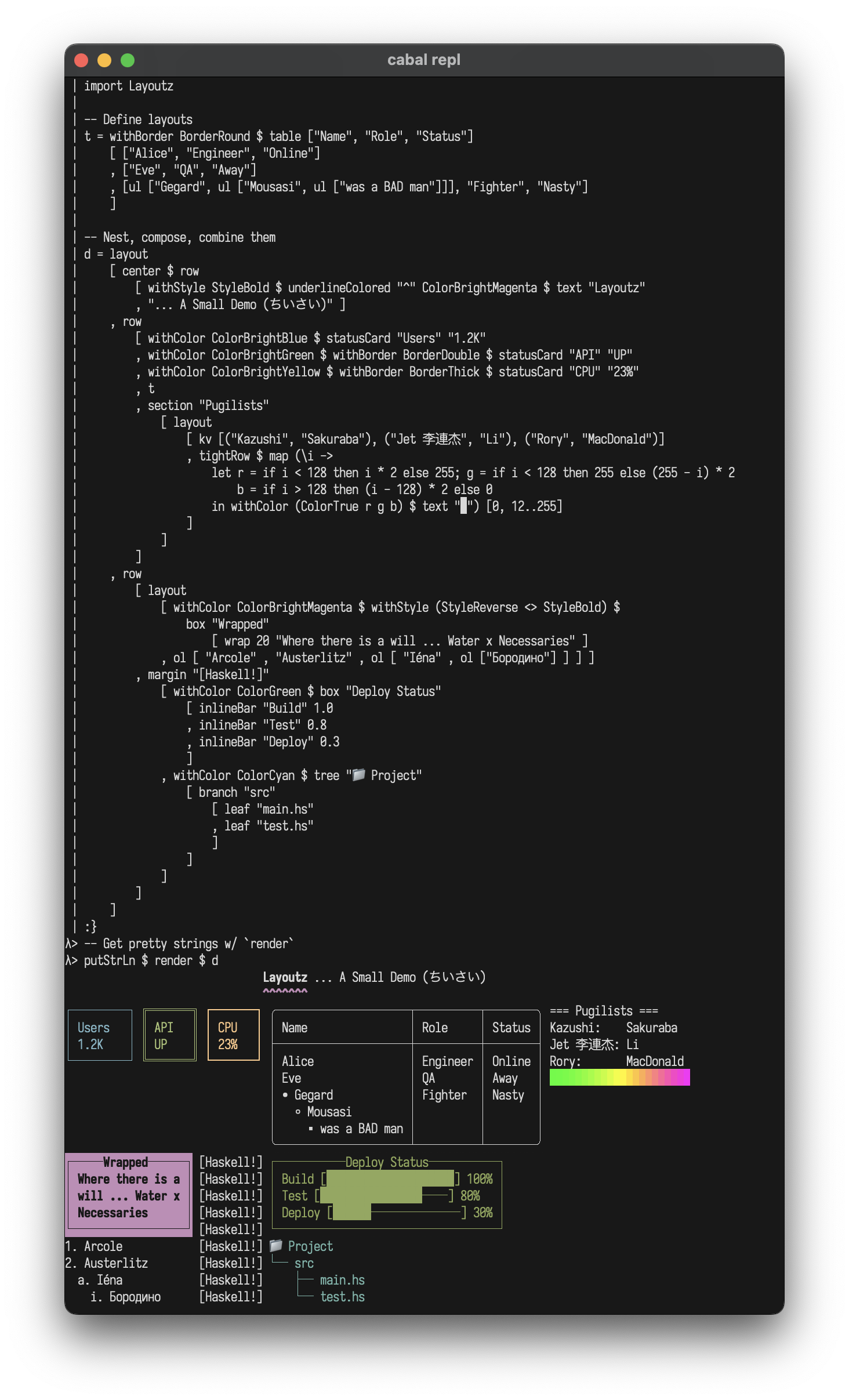
Beautiful, compositional text layouts:
import Layoutz

demo = layout
  [ center $ row ["Layoutz", underline' "ˆ" $ text "DEMO"]
  , br
  , row
    [ statusCard "Users" "1.2K"
    , withBorder BorderDouble $ statusCard "API" "UP"
    , withBorder BorderThick $ statusCard "CPU" "23%"
    , withBorder BorderRound $ table ["Name", "Role", "Status"]
        [ ["Alice", "Engineer", "Online"]
        , ["Eve", "QA", "Away"]
        ]
    , section "Pugilists" [kv [("Kazushi", "Sakuraba"), ("Jet", "Li")]]
    ]
  ]

putStrLn $ render demo
                                Layoutz DEMO
                                        ˆˆˆˆ

┌─────────┐ ╔═══════╗ ┏━━━━━━━┓ ╭───────┬──────────┬────────╮ === Pugilists ===
│ Users   │ ║ API   ║ ┃ CPU   ┃ │ Name  │ Role     │ Status │ Kazushi: Sakuraba
│ 1.2K    │ ║ UP    ║ ┃ 23%   ┃ ├───────┼──────────┼────────┤ Jet:     Li
└─────────┘ ╚═══════╝ ┗━━━━━━━┛ │ Alice │ Engineer │ Online │
                                │ Eve   │ QA       │ Away   │
                                ╰───────┴──────────┴────────╯
Core concepts
- Every piece of content is an
Element - Elements are immutable and composable - build complex layouts by combining simple elements
- A
layoutarranges elements vertically:
layout [elem1, elem2, elem3] -- Joins with "\n"
Call render on any element to get a string
The power comes from uniform composition - since everything has the Element typeclass, everything can be combined.
String Literals
With OverloadedStrings enabled, you can use string literals directly:
layout ["Hello", "World"] -- Instead of layout [text "Hello", text "World"]
Note: When passing to functions that take polymorphic Element a parameters (like underline', center', pad), use text explicitly:
underline' "=" $ text "Title"  -- Correct
underline' "=" "Title"         -- Ambiguous type error
Elements
Text
text "Simple text"
-- Or with OverloadedStrings:
"Simple text"
Simple text
Line Break
Add line breaks with br:
layout ["Line 1", br, "Line 2"]
Line 1

Line 2
Section: section
section "Config" [kv [("env", "prod")]]
section' "-" "Status" [kv [("health", "ok")]]
section'' "#" "Report" 5 [kv [("items", "42")]]
=== Config ===
env: prod

--- Status ---
health: ok

##### Report #####
items: 42
Layout (vertical): layout
layout ["First", "Second", "Third"]
First
Second
Third
Row (horizontal): row
Arrange elements side-by-side horizontally:
row ["Left", "Middle", "Right"]
Left Middle Right
Multi-line elements are aligned at the top:
row
  [ layout ["Left", "Column"]
  , layout ["Middle", "Column"]
  , layout ["Right", "Column"]
  ]
Tight Row: tightRow
Like row, but with no spacing between elements (useful for gradients and progress bars):
tightRow [withColor ColorRed $ text "█", withColor ColorGreen $ text "█", withColor ColorBlue $ text "█"]
███
Text alignment: alignLeft, alignRight, alignCenter, justify
Align text within a specified width:
layout
  [ alignLeft 40 "Left aligned"
  , alignCenter 40 "Centered"
  , alignRight 40 "Right aligned"
  , justify 40 "This text is justified evenly"
  ]
Left aligned
               Centered
                           Right aligned
This  text  is  justified         evenly
Horizontal rule: hr
hr
hr' "~"
hr'' "-" 10
──────────────────────────────────────────────────
~~~~~~~~~~~~~~~~~~~~~~~~~~~~~~~~~~~~~~~~~~~~~~~~~~
----------
Vertical rule: vr
row [vr, vr' "║", vr'' "x" 5]
│ ║ x
│ ║ x
│ ║ x
│ ║ x
│ ║ x
│ ║
│ ║
│ ║
│ ║
│ ║
Key-value pairs: kv
kv [("name", "Alice"), ("role", "admin")]
name: Alice
role: admin
Table: table
Tables automatically handle alignment and borders:
table ["Name", "Age", "City"]
  [ ["Alice", "30", "New York"]
  , ["Bob", "25", ""]
  , ["Charlie", "35", "London"]
  ]
┌─────────┬─────┬─────────┐
│ Name    │ Age │ City    │
├─────────┼─────┼─────────┤
│ Alice   │ 30  │ New York│
│ Bob     │ 25  │         │
│ Charlie │ 35  │ London  │
└─────────┴─────┴─────────┘
Unordered Lists: ul
Clean unordered lists with automatic nesting:
ul ["Feature A", "Feature B", "Feature C"]
• Feature A
• Feature B
• Feature C
Nested lists with auto-styling:
ul [ "Backend"
   , ul ["API", "Database"]
   , "Frontend"
   , ul ["Components", ul ["Header", ul ["Footer"]]]
   ]
• Backend
  ◦ API
  ◦ Database
• Frontend
  ◦ Components
    ▪ Header
      • Footer
Ordered Lists: ol
Numbered lists with automatic nesting:
ol ["First step", "Second step", "Third step"]
1. First step
2. Second step
3. Third step
Nested ordered lists with automatic style cycling (numbers → letters → roman numerals):
ol [ "Setup"
   , ol ["Install dependencies", "Configure", ol ["Check version"]]
   , "Build"
   , "Deploy"
   ]
1. Setup
  a. Install dependencies
  b. Configure
    i. Check version
2. Build
3. Deploy
Underline: underline
Add underlines to any element:
underline "Important Title"
underline' "=" $ text "Custom"  -- Use text for custom underline char
Important Title
───────────────

Custom
══════
Box: box
With title:
box "Summary" [kv [("total", "42")]]
┌──Summary───┐
│ total: 42  │
└────────────┘
Without title:
box "" [kv [("total", "42")]]
┌────────────┐
│ total: 42  │
└────────────┘
Status card: statusCard
statusCard "CPU" "45%"
┌───────┐
│ CPU   │
│ 45%   │
└───────┘
Progress bar: inlineBar
inlineBar "Download" 0.75
Download [███████████████─────] 75%
Tree: tree
tree "Project"
  [ branch "src"
      [ leaf "main.hs"
      , leaf "test.hs"
      ]
  , branch "docs"
      [ leaf "README.md"
      ]
  ]
Project
├── src
│   ├── main.hs
│   └── test.hs
└── docs
    └── README.md
Chart: chart
chart [("Web", 10), ("Mobile", 20), ("API", 15)]
Web    │████████████████████ 10
Mobile │████████████████████████████████████████ 20
API    │██████████████████████████████ 15
Padding: pad
Add uniform padding around any element:
pad 2 $ text "content"
content
Centering: center
Smart auto-centering and manual width:
center "Auto-centered"     -- Uses layout context
center' 20 "Manual width"  -- Fixed width
        Auto-centered

    Manual width
Margin: margin
Add prefix margins to elements for compiler-style error messages:
margin "[error]"
  [ text "Ooops"
  , text ""
  , row [ text "result :: Int = "
        , underline' "^" $ text "getString"
        ]
  , text "Expected Int, found String"
  ]
[error] Ooops
[error]
[error] result :: Int =  getString
[error]                  ^^^^^^^^^
[error] Expected Int, found String
Border Styles
Elements like box, table, and statusCard support different border styles:
BorderNormal (default):
box "Title" ["content"]
┌──Title──┐
│ content │
└─────────┘
BorderDouble:
withBorder BorderDouble $ statusCard "API" "UP"
╔═══════╗
║ API   ║
║ UP    ║
╚═══════╝
BorderThick:
withBorder BorderThick $ table ["Name"] [["Alice"]]
┏━━━━━━━┓
┃ Name  ┃
┣━━━━━━━┫
┃ Alice ┃
┗━━━━━━━┛
BorderRound:
withBorder BorderRound $ box "Info" ["content"]
╭──Info───╮
│ content │
╰─────────╯
BorderNone (invisible borders):
withBorder BorderNone $ box "Info" ["content"]
  Info
 content
Colors (ANSI Support)
Add ANSI colors to any element:
layout[
  withColor ColorRed $ text "The quick brown fox...",
  withColor ColorBrightCyan $ text "The quick brown fox...",
  underlineColored "~" ColorRed $ text "The quick brown fox...",
  margin "[INFO]" [withColor ColorCyan $ text "The quick brown fox..."]
]
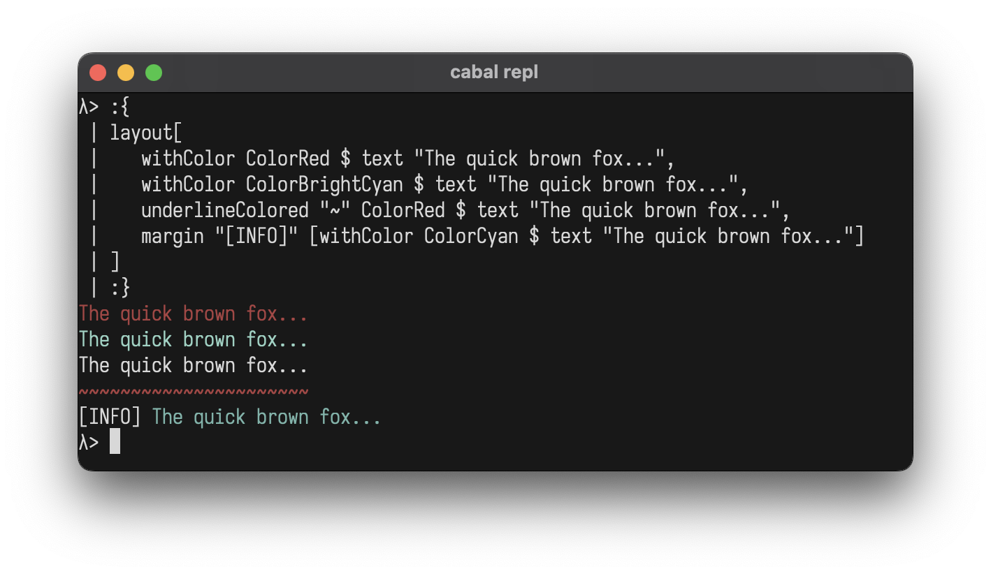
Standard Colors:
ColorBlackColorRedColorGreenColorYellowColorBlueColorMagentaColorCyanColorWhiteColorBrightBlackColorBrightRedColorBrightGreenColorBrightYellowColorBrightBlueColorBrightMagentaColorBrightCyanColorBrightWhiteColorNoColor(for conditional formatting)
Extended Colors:
ColorFull n- 256-color palette (0-255)ColorTrue r g b- 24-bit RGB true color
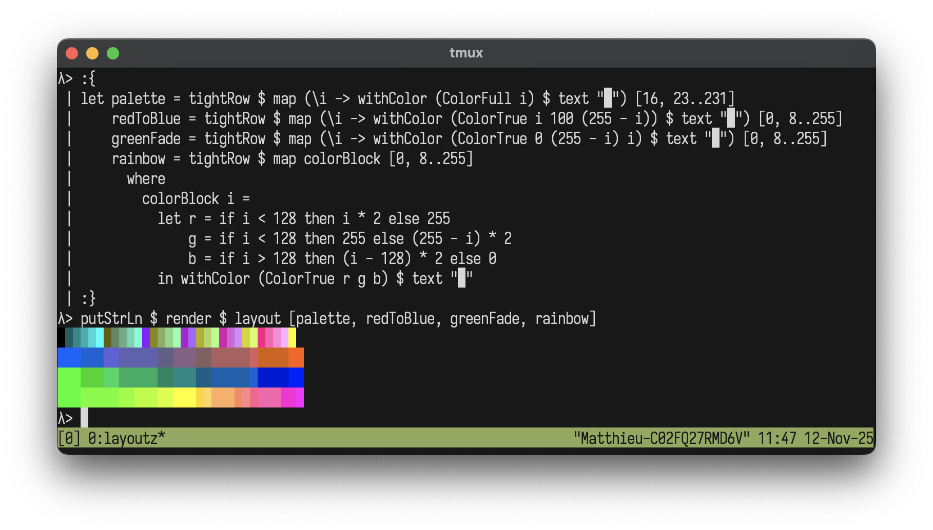
Color Gradients
Create beautiful gradients with extended colors:
let palette = tightRow $ map (\i -> withColor (ColorFull i) $ text "█") [16, 18..231]
    redToBlue = tightRow $ map (\i -> withColor (ColorTrue i 100 (255 - i)) $ text "█") [0, 4..255]
    greenFade = tightRow $ map (\i -> withColor (ColorTrue 0 (255 - i) i) $ text "█") [0, 4..255]
    rainbow = tightRow $ map colorBlock [0, 4..255]
      where
        colorBlock i =
          let r = if i < 128 then i * 2 else 255
              g = if i < 128 then 255 else (255 - i) * 2
              b = if i > 128 then (i - 128) * 2 else 0
          in withColor (ColorTrue r g b) $ text "█"

putStrLn $ render $ layout [palette, redToBlue, greenFade, rainbow]
Styles (ANSI Support)
Add ANSI styles to any element:
layout[
  withStyle StyleBold $ text "The quick brown fox...",
  withColor ColorRed $ withStyle StyleBold $ text "The quick brown fox...",
  withStyle StyleReverse $ withStyle StyleItalic $ text "The quick brown fox..."
]
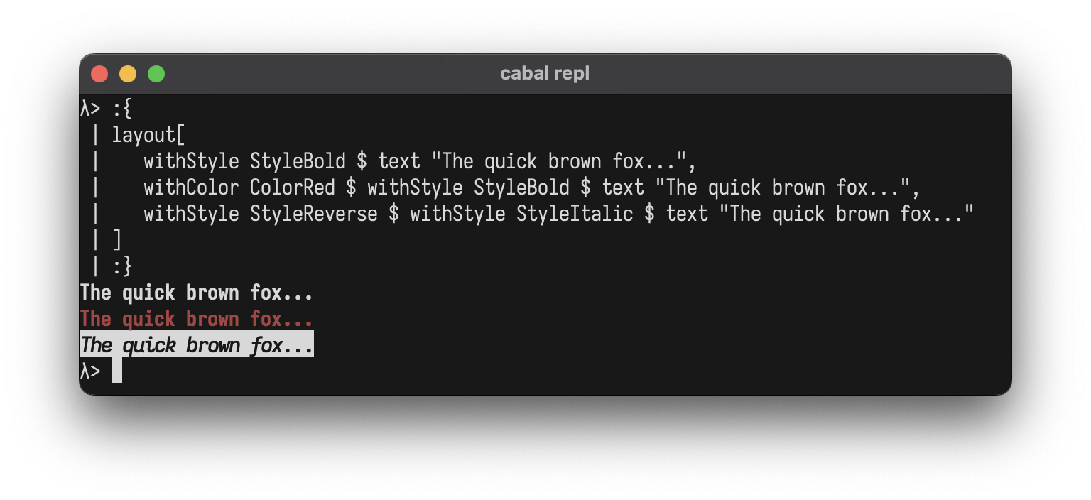
Styles:
StyleBoldStyleDimStyleItalicStyleUnderlineStyleBlinkStyleReverseStyleHiddenStyleStrikethroughStyleNoStyle(for conditional formatting)
Combining Styles:
Use <> to combine multiple styles at once:
layout[
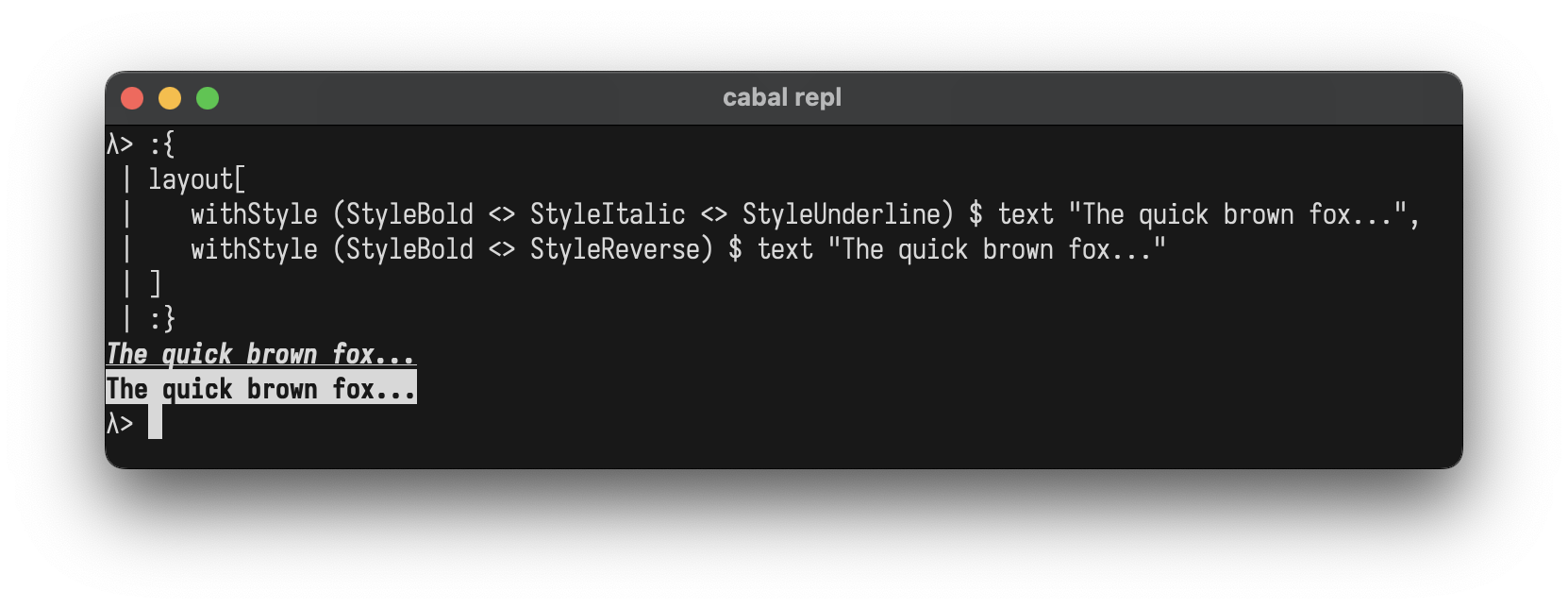
withStyle (StyleBold <> StyleItalic <> StyleUnderline) $ text "The quick brown fox...",
withStyle (StyleBold <> StyleReverse) $ text "The quick brown fox..."
]
You can also combine colors and styles:
withColor ColorBrightYellow $ withStyle (StyleBold <> StyleItalic) $ text "The quick brown fox..."
Custom Components
Create your own components by implementing the Element typeclass
data Square = Square Int

instance Element Square where
  renderElement (Square size)
    | size < 2 = ""
    | otherwise = intercalate "\n" (top : middle ++ [bottom])
    where
      w = size * 2 - 2
      top = "┌" ++ replicate w '─' ++ "┐"
      middle = replicate (size - 2) ("│" ++ replicate w ' ' ++ "│")
      bottom = "└" ++ replicate w '─' ++ "┘"

-- Helper to avoid wrapping with L
square :: Int -> L
square n = L (Square n)

-- Use it like any other element
putStrLn $ render $ row
  [ square 3
  , square 5
  , square 7
  ]
┌────┐ ┌────────┐ ┌────────────┐
│    │ │        │ │            │
└────┘ │        │ │            │
       │        │ │            │
       └────────┘ │            │
                  │            │
                  └────────────┘
REPL
Drop into GHCi to experiment:
cabal repl
λ> :set -XOverloadedStrings
λ> import Layoutz
λ> putStrLn $ render $ center $ box "Hello" ["World!"]
┌──Hello──┐
│ World!  │
└─────────┘
λ> putStrLn $ render $ table ["A", "B"] [["1", "2"]]
┌───┬───┐
│ A │ B │
├───┼───┤
│ 1 │ 2 │
└───┴───┘
Inspiration
- Original Scala layoutz